
W E B S I T E R E D E S I G N
Red Cross
Empowering users to donate to causes, no matter the amount and working to create a positive impact by driving change through design.
This project was created as 5 day design sprint in collaboration with the User Experience team at BrainStation.
Role UX Designer, Copywriter, Asset Collector
Duration 5 days | January 2022
Tools used Figma, Google Drive, Slack
The Challenge
With an increase of global crisis many organizations are seeking help through donations.

Our challenge was to reimagine a Canadian based charity in 5 days to empower their cause and leverage their impact in order to drive donations.
Initial Research
As a team, we’ve focused on refining the donation experience of the Canadian Red Cross website.
This large organization is known by almost everyone, but when we explored the site as new users, we found multiple areas that could be helped.

Why the Canadian Red Cross?
Upon browsing their site, we saw areas for design intervention that would help improve the user experience and further drive impact and support on the world’s most pressing challenges.
The site feels clinical
Tons of useful information blanketed by an overwhelming experience
Multiple donation flows create a confusing experience
Enhancing user experience could bring in more donations
Insights
While our goal was set to make a website more informative and inviting for a new donors we’ve asked our interviewees what do they think of the existing website. That’s where we discovered that:
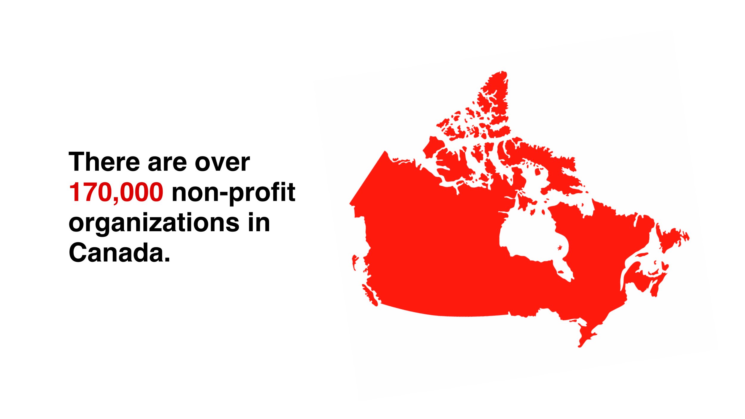
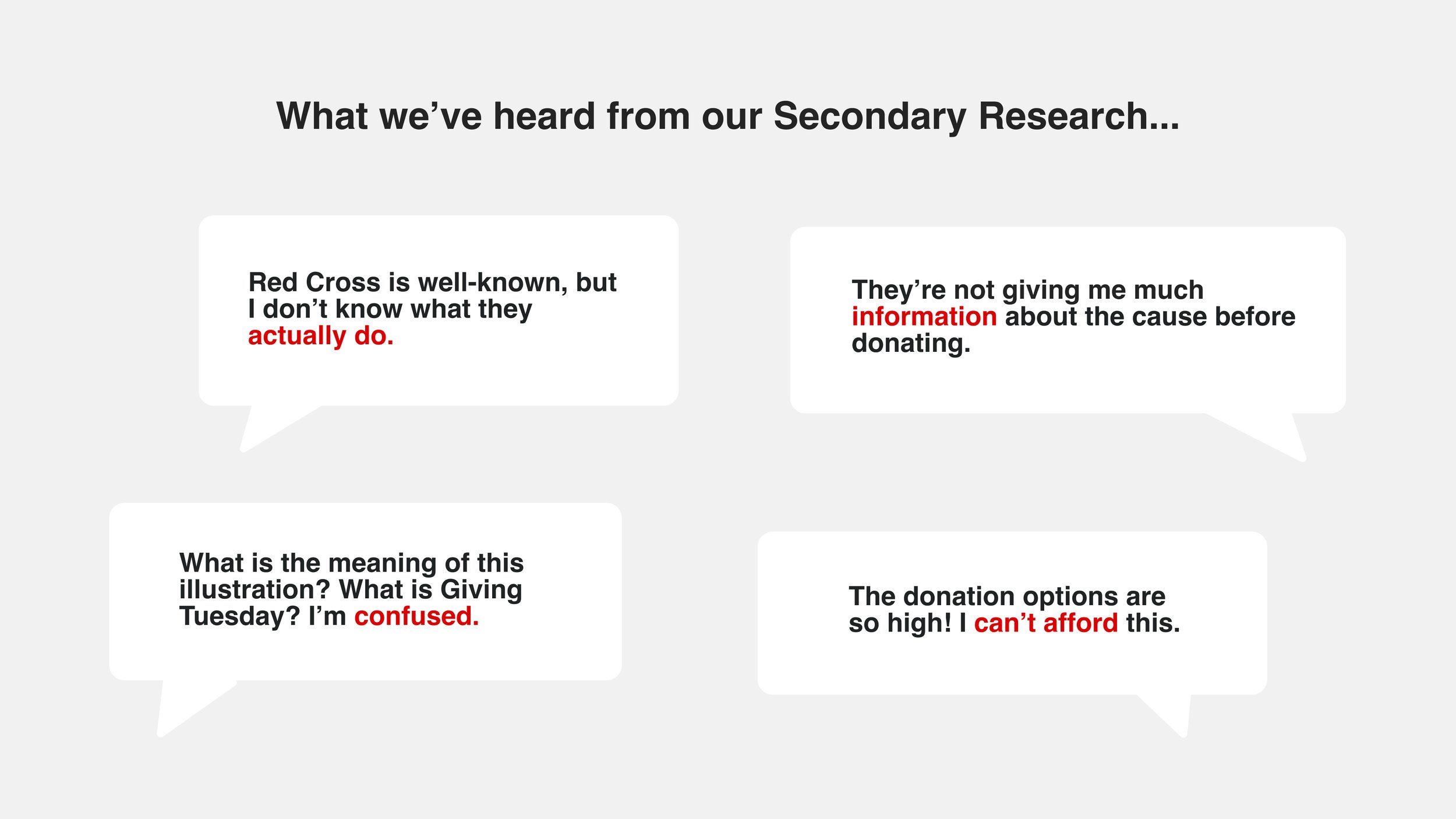
🤷🏻♂️ People know Red Cross as a “Large” organization. But how large is it?
What do they do?
🔍 Finding specific information on the website is problematic
💰 Interviewers expressed opinions that Donation amounts seemed to be overwhelming and out of their budget
I am not sure where my donation goes and if my $5 would make an impact at all”
Interviewee
When speaking to people about their past donation experiences, one interviewee said something that stuck with us: “I am not sure where my donation goes and if my $5 would make an impact at all.”
We believe that even the smallest action is better than not contributing at all. If every person, who thought they couldn’t make a difference with their minimal contribution, gave 5 dollars to a non-profit organization, imagine what an impact that would make.
How might we create an inviting and accessible experience for new donors so that donating to the Canadian Red Cross feels easy and impactful?
Persona and Experience Mapping
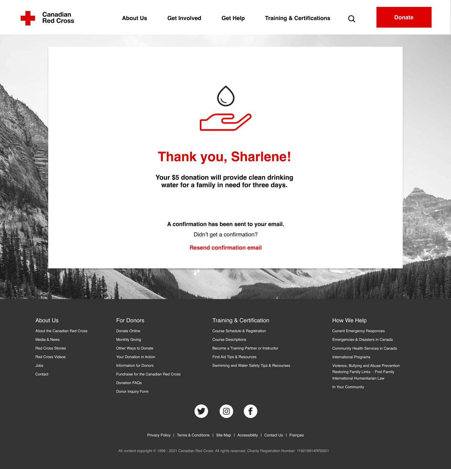
Meet our Persona, Sharlene Kaur, a student of the UBC, who is conscious about world crisis and disasters and wants to make a difference, but she is not sure if her budget allows her to be a donor.


Design Process
During our design process, we focused on 4 elements in order to encapsulate the human-centred experience:
📦 Reorganizing the content on each page, users are able to digest and absorb information without feeling overwhelmed by large blocks of text.
👏🏼 Encouraging donations we focused on creating accessible design. Our hope was to prompt donors of all varying ages and income levels to feel like they’ve made a difference.
💵 Visualizing donor impact by quantifying their donations and making them feel good about their decisions.
🌍 Creating trust with new users by providing insight and transparency on what the Red Cross does and their efforts in global humanitarian crises.
Exploratory Sketches
Sketches were created to ideate potential screens to optimize Red Cross brand awareness and user experience.


Design Solution
Finalized landing page and Donation page on the proposed website.


-
![]()
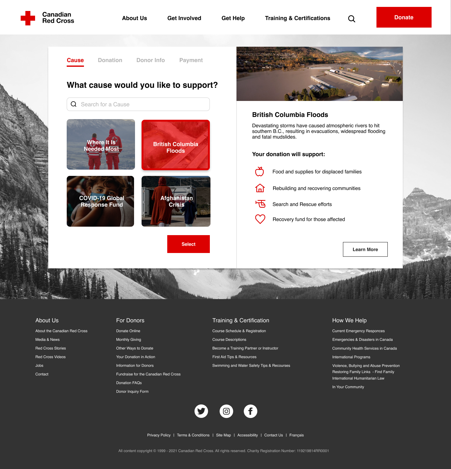
Select a cause
-
![]()
Donation
-
![]()
Donor Info
-
![]()
Payment
-
![]()
Confirmation


Final Thoughts
Due to the time constraints of this design sprint, we didn’t have the resources to implement all user feedback.
For our next steps, we want to potentially:
👇 Create a drop-down navigation menu to expand on other areas
📅 Create a page in which all current events can be viewed
🤝 Expand on the user experience of other flows, such as registering for help and create a mobile site prototype