B R A I N S T A T I O N C A P S T O N E
CommUnity
Building stronger communities, one connection at at time with CommUnity. A mobile app driving newcomer connections.
This project was created as my final capstone project at the BrainStation over the span of 12 weeks including processes such as research, ideation and prototyping.
Role UX Designer, Copywriter, Asset Collector
Duration 12 weeks | October 2021-January 2022
Tool Used Figma
Problem Space
Due to a lack of language and community support, many first generation immigrant families often live in isolation and are unaware of the vast amount of resources that are currently provided by community organizations.
Original illustration by Stephanie San

Hypothesis
My hypothesis is that bridging the gap by improving the user experience for newcomer immigrants accessing programs willl in turn build community connections. I’ll know I’m right when there’s an increase in community program participation.
Goals
I set a group of project goals to drive my research process before delivering my ultimate impact:
Build stronger communities by efficiently and effectively connecting people to other community members and resources.


Constraints
I also took into consideration any real-world constraints during the development process, focusing on technical, business and socio-cultural barrier that may prevent me from fulling translating this app.


Research
During the study, I will be conducting 3 user interviews, approximately 25 minutes each with a set of 5 general questions and 13 specific questions per participant to dive deeper into their community event experiences.

Key Findings
From the interviews conducted, I organized my findings into pains, motivations and behaviours. This allowed me to find common ground between experiences and further develop my insights.


Many interviewees spoke on their difficulties finding a source of truth, wanting to connect outside of their bubbles, attending local landmarks and an overall lack of accessbility to community events.
I decided to focus on enhancing the accessibility of programs as it was a precursor for the other insights.
This led me to ask,
How might we compel first generation immigrants to access local events in order for them to build strong connections with community members and leaders equipped with resources and guidance?
Persona + Experience Mapping
In an attempt to identify newcomer needs, I created a proto-persona to gain perspective as a potential user for the project. Creating Souma aided me in discovering her goals, behaviours and frustrations through her shoes. To further synthesize Souma’s journey as a newcomer, I built an experience map to track her current process and pinpoint a space for design intervention. Determining this pinpoint of the journey was difficult because there was a plethora of painpoints within the newcomer journey. Deciding on one key point to focus on when building community became more clear through the these processes.


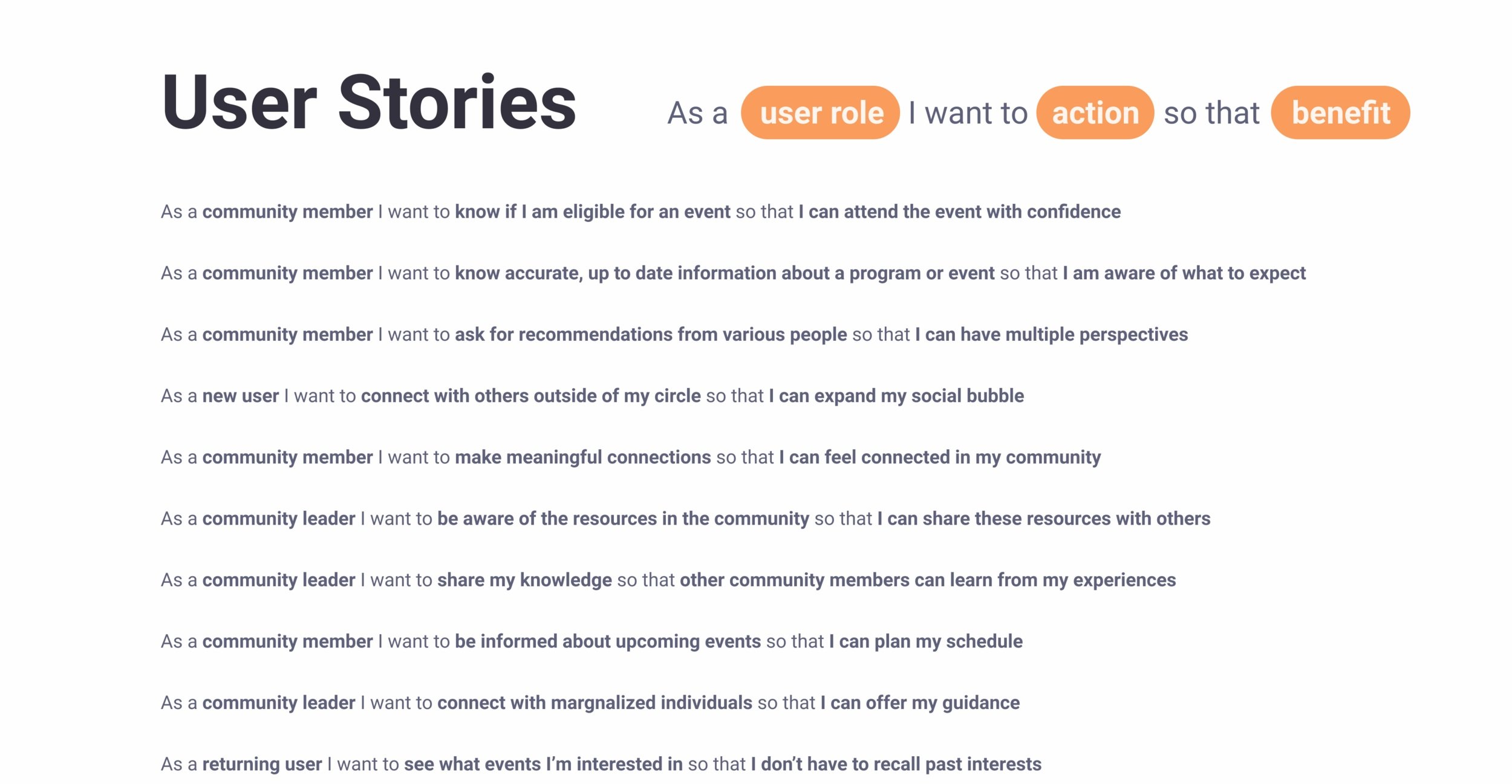
Task Selection
To further determine the task I would be prototyping, I went through a series of user stories through the potential points of view of my application. Illustrating these users perspectives allowed me to expand and focus on a core epic that would drive my task flow.


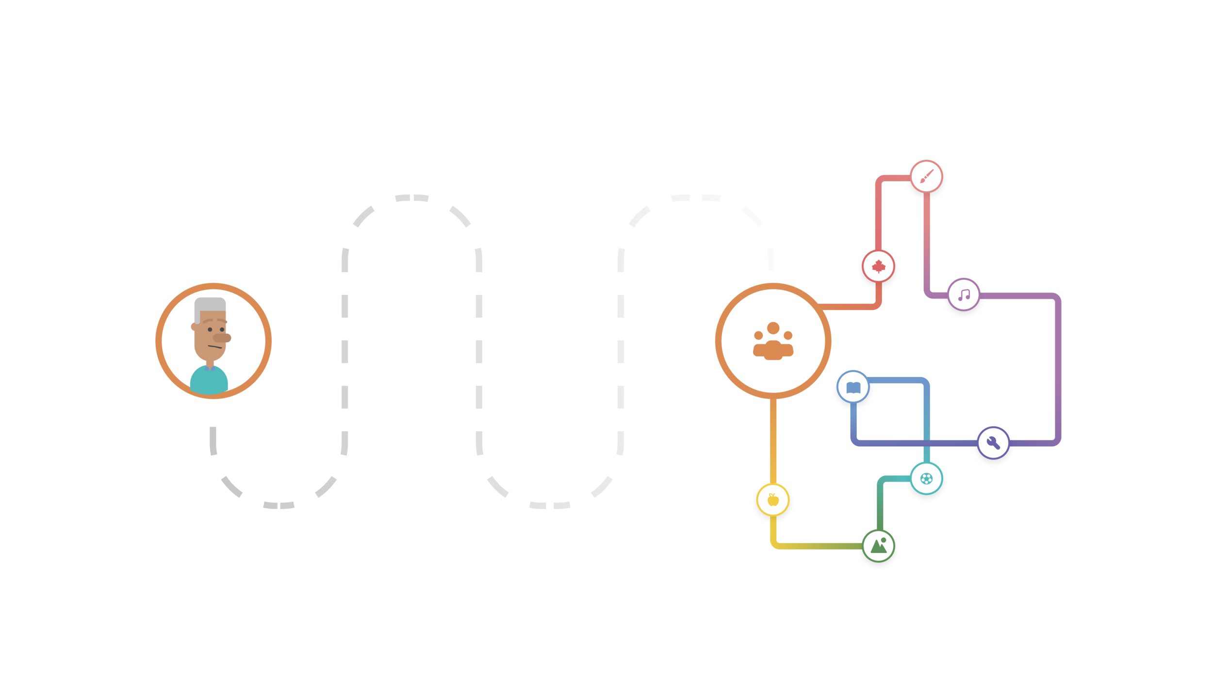
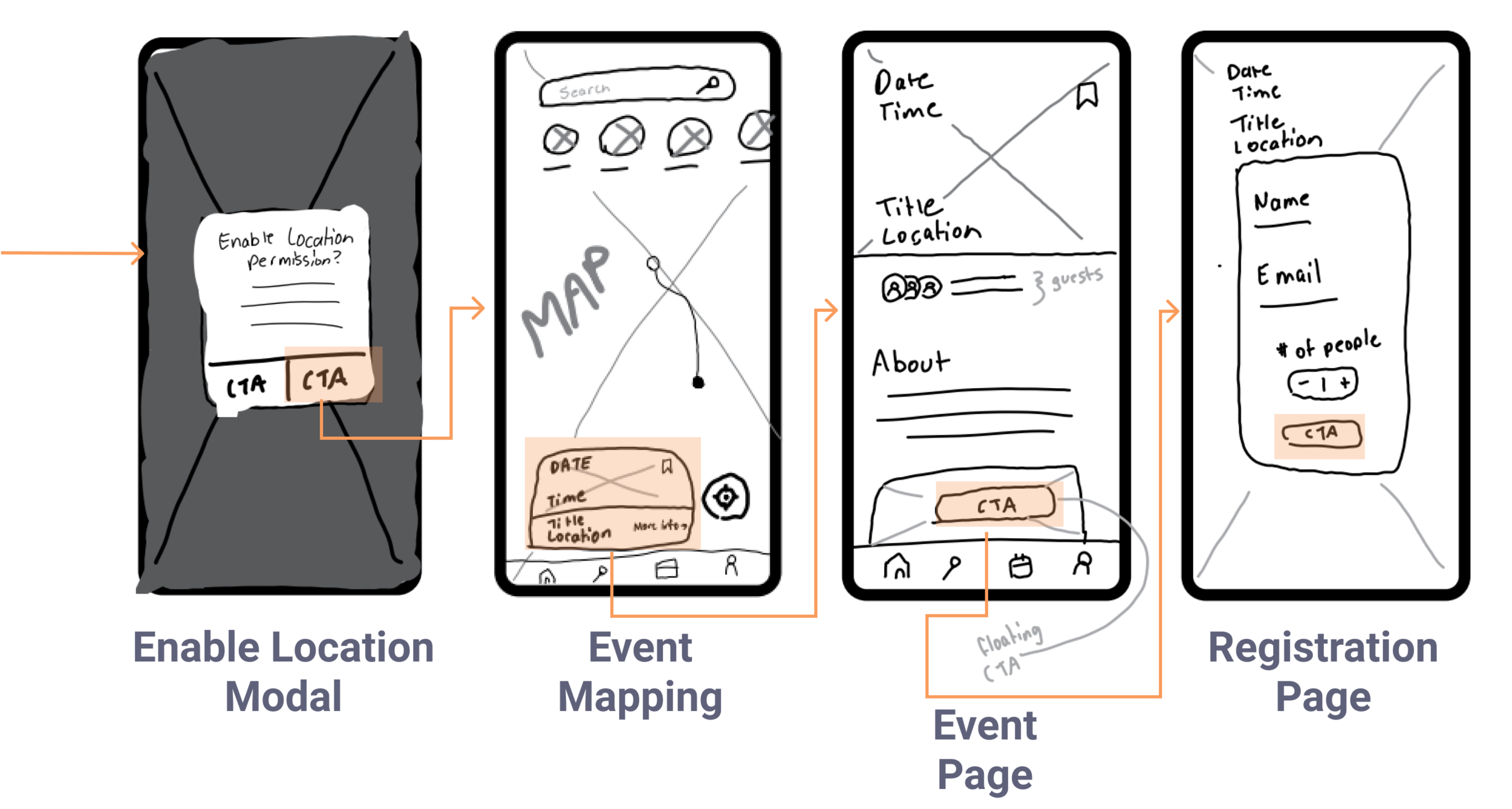
Task Flow
I created a task flow to identity the core functions of the application. Visually mapping out the functions from start to finish helped me recognize the variety of components that would be needs to complete the task.

UI Inspiration
During the ideation stage, it was essential to prioritize the user experience and visualize through the eyes of our developed persona. With this in mind I decided to implement elements of choosing interests for a personalized experience, the ability to map locations and clear event information.

Exploratory Sketching
Selecting Interests
Users can select interests to curate and filter for events that they are interested in. A few iterations were created to visualize the selection process. Although this is a simple screen, it is important to create a friendly, engaging engaging process as this serves as an initial onboarding screen as a new user.

Event Planning
When users arrive at the event page, hierchy of information is important. I created multiple iterations with differing information visualization to get a sense of where the eye gravitates to when searching for information regarding an event.

Location Mapping
Most mobile users have used the map feature on their device at least once in their lifetimes. Iterations made were similar in features and functions with small changes between them. I wanted to focus on creating a recognizable and familiar map system so that features are intuitive for users.

Solution Sketches
After iterating my exploratory sketches, I combined some of my favourite elements to create my final solution sketches and highlighted areas of potential interactions.

Wireframes/Greyscale
I directly translated my sketches into my initial prototype, prioritizing function over beauty when visualizing the task flow, .

Round 1 User Testing
To verify the effectiveness of my design solution I conducted 2 rounds of usability testing with 3 testers per round.
The first round of usability testing was conducted on December 16th, 2021 over video and voice call where participants were asked to show their screens. Users were sent prototypes and were tracked of their cursor movements and touchpoints. We focused on the ‘search and join an event experience.’ The purpose of this usability test was to receive synchronous reviews about the app in order to further improve and implement its features.
We asked 5 participants, one session each, to test the initial prototype.


From the testing process, we were able to discover a few gaps in the project. Although all testers were able to successfully complete all 5 tasks, there are some changes that could be made to optimize the searching and joining and event experience.
Most testers thought that the information on the cards specifically on the mapping page were too small to read and wanted to enlarge text for clarity
The map page was engaging and aided users that didn’t know the community well. However some testers did not instinclty recognize their own location.
Testers were unsure when they registered for the event as the status change for their participation was minimal and confusing.

A prioritization matrix was created to identify changes that would add the most value to the user. The changes above were made to the greyscale to be prepared for another round of usability testing.


Round 2 User Testing
The second round of usability testing was conducted on December 19th, 2021 over video and voice call where participants were asked to show their screens. Users were sent prototypes and were tracked of their cursor movements and touchpoints. We focused on the ‘search and join an event experience.’ The purpose of this usability test was to receive synchronous reviews about the app in order to further improve and implement its features.
We asked 5 participants, one session each, to test the initial prototype.

From the testing process, I was able to discover a few gaps in the project. Although all testers were able to successfully complete all 5 tasks, there are some changes that could be made to optimize the searching and joining and event experience.
Testers were concerned that the white text on the photos would be hard to see and that accessbility and visbility should be increased.
Some testers also wondered if they were able to view the guestlist, and wanted a CTA for that action before deciding to register for the event.
The visbility and size of the font on the email confirmation page was small and could user improvement with a size increase.


Brand Development
Brand Name
To synthesize the brand, I picked adjectives to describe the brand I had in mind and used a ‘This more than that’ chart in further develop my ideas. From there I was able to come up with various names while settling on CommUnity.

Moodboard
In addition, I created a mood board to get a feel for what the CommUnity brand stood for. Words like welcoming, friendly and radiant were in mind when creating the visual mood of CommUnity.

Wordmark Ideation
When ideating for the wordmark, I worked on refining the design with the connected m and U letters. This design choice tied in with the identity of the app centred on community connection. Choosing a Sans Serif font over a serif font was decided based on branding. Althogh the serif type faces gave a classic and elegant feel, I wanted to convey a feeling of welcomeness with soft, and playful lines. Out of all the typefaces I analyzed, Hara Bara Mais fit the match.
Sketching
I initialized my wordmark ideation by using an ink pen on paper. This process allowed me to focus on the ‘friendly’ aspect of CommUnity and aided in the development of connecting letters as a parallel to the idea of community connection.


Final Wordmark
To create a more dynamic logo, I iterated designs with connected circles added to mimic two points connecting. This small addition relays the connection aspect of the app that connects people to events, resources, and others in their community.

Colour Style
I wanted to showcase the spectrum of a community within the brand identity, picking vibrant colours to signify the mosaic of diverse people. The main orange was chosen in the logo represents a sign of hope and energy for newcomers.


Type Style

Hi-Fidelity Prototype
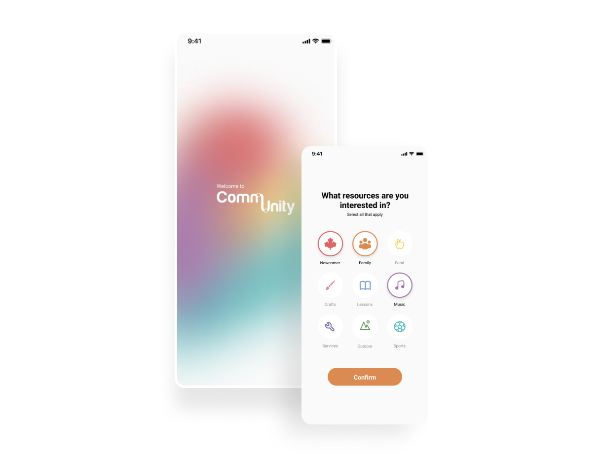
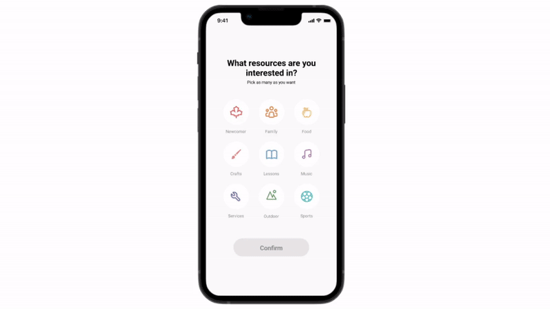
Selecting Interests
CommUnity gives users the ability to curate their feeds by selecting their interests. By collecting these choices and inserting them into the algorithm, CommUnity puts the user’s needs first without the hassle.

Explore Page
By curating the user’s initial interests from the onboarding session, the explore page focuses on enhancing the user experience through efficiency. Pushing interested events closer to the top allows the user save time on the event finding process.

Event Page
When entering the event page, users can quickly scan the nature of the event before registering for the event. The registration prefills in information loaded from the profile, allowing the user to complete registration in one tap.
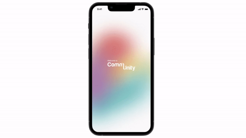
Starting Screen
When users download and boot up CommUnity, they’re met with a vibrant loading screen before being prompted to log in. Users will be able to recognize that they are able to log in using their social media account and find former friends.
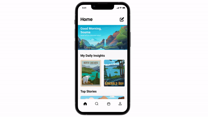
Home Page
The CommUnity home page is filled with essential resources for newcomers by local community leaders and centres. Clean article titles prevent information overload as seen on official government websites and blogs. This page was designed to create a welcoming and accessible hub for knowledge.
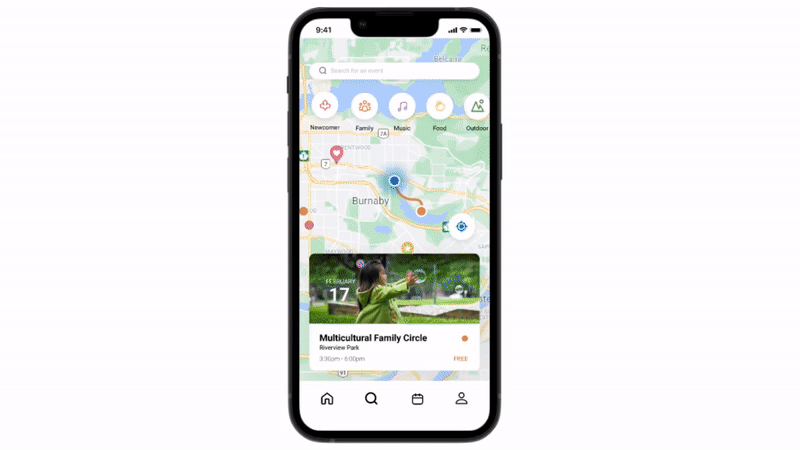
Map Feature
If a user is unfamiliar with the locations stated on the explore page, they can simply toggle their search to the map menu. By enabling their location, they are able to view the closest events to cut down on any transit worries.
UI Library
I created a guide of all elements with a UI library and guide for gridlines. This was created to aid future developers of the project concretely build out the app with precision.


Marketing Website
To market the community app, I created a responsive website for both mobile and desktop options. Although very similar in nature, the responsiveness of each platform differs due to the variety in horizontal space allotted.


Alternate platform
Although CommUnity was made native for mobile, I wanted to provide an alternative platform. By creating a desktop site, this provides users with a larger screen for easier visible accessibility. By using the same elements from the mobile app, the desktop site creates a similar flow with enhanced visibility.


Next Steps + What I learned
So what’s next?
I hope to build out CommUnity and its features targeting the additional insights from my interviews. I also hope to validate my hypothesis and conduct additional interviews with newcomer immigrants in order to hone in on their needs.
We don’t always need to innovate to improve the user experience. Through this project I also learned the value in listening. By pinpointing frustrations, behaviors and goals I was able to create something that enhances and puts the user first.